Introduction
Artsy Editor was a little idea I had 2 weeks ago. 9 days after that, I showed 1000+ people my mockup, validated with 109 people personally, and 38 of them were already ready to pay for it.
This is not a getting-rich-overnight story. This is not a telling-you-exactly-what-to-do story. This is a post where I share how I did it and the techniques I used. If you have an idea and wonder where to begin, this post is for you.
Without further ado, let’s get into the story:
Once upon a time…
I use WordPress for product announcements and behind-the-scene stories of OhBoard, my $3.99 whiteboard app for Google Chrome. It was an OK experience at first. But as I started to write more and more, I felt like the interface was too crowded. There were too many elements that I didn’t need, but the area I heavily relied on – the text box – was only a small portion of the screen. It was like writing on a piece of paper with boxes and lines filling up all over it, with little empty space left.
It was a horrible experience. I hated it.
Few months ago: I came across a gorgeous writing application made for distraction-free writing. It was called OmmWriter. It had some sophisticated background image and audio that put me in the zen-like writing mood.
Two weeks ago: A Mac app called Byword was released. It was similar to OmmWriter, but with an even simpler interface, no background image, no background audio, just text and some formatting options in a minimalist environment. I fell in love with it as well.
My bad experience on WordPress and these 2 great writing apps triggered my mind all together at one point. I thought why shouldn’t I bring the minimalist writing interface into WordPress and solve many specific problems with WordPress’ editor?
March 20, Sunday
Facebook conversation
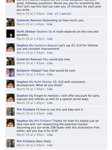
1:00 PM: It all started as a product research question on Facebook, the place where my closest friends were. I simply asked if people will be interested in something like this.

Although I didn’t get a lot of responses, the results were satisfied. Within 2.5 hours, I received 6 responses. 3 of them were willing to pay.

Technique #1: Offer incentives when asking for feedback on ideas. Think about it: get free stuff for giving honest opinions, isn’t it a great deal? I gave away 2 Startup Weekend tickets that I purchased from AppSumo SXSW bundle. People were motivated to answer my questions.
Facebook chat
1:30PM: While waiting for responses, I reached out to 14 of my friends that were online at that time. I knew I could get a lot out of chatting with people one-on-one.
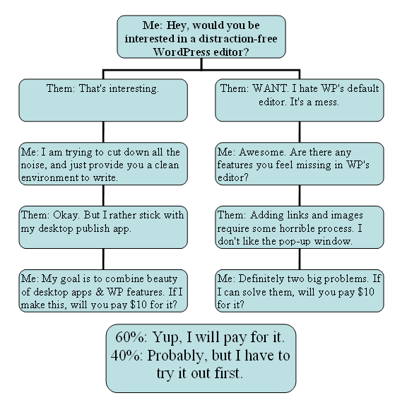
I don’t want to share actual screenshots, I will tell you how the conversation generally went:

Technique #2: Ask people what their problems are, then ask if they are willing to pay if I can solve their problems. I can see directly what features I need to include to make it something worth paying for.
Twitter conversation
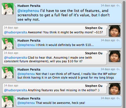
4:00 PM: Few hours after I asked on Facebook, I turned to Twitter. I have ~2000 followers, and I also decided to give away 2 $50 Twilio credits, which are developers’ favorite. So the amount of feedback I got were fairly good. Though the 140 characters limit did stop many people from sharing their full opinions.
I was be able to validate the idea with 11 people, and 3 people were willing to pay for it.

Technique #3: Follow-up quickly. Usually after the first question, I have several more follow-up questions. I don’t want them to leave the conversation so I rather ask them within minutes after their original replies.
Email friends
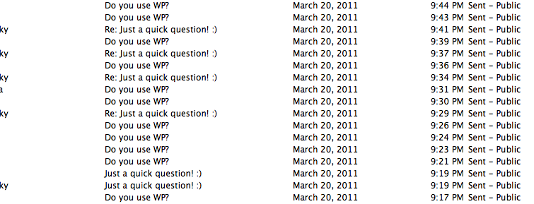
8:00 PM: After the success on Facebook and Twitter, I turned to my address book which contained more than 200 business contacts. They were mostly designers, developers or product guys. A good amount of them had came across WordPress sometimes in their life. So, I thought the responses I would get would be fairly valuable. I eventually sent out 96 emails and I got 71 replies. I was be able to validate the idea with 53 people, and 32 people were willing to pay for it. Not bad.

Some replies I got really proved the potential of my idea:


Technique #4: Send out emails Sunday night. The chance of getting a reply will be high. I assume it’s because the first thing people do in Monday morning is to check their emails. Therefore, the response rate is higher.
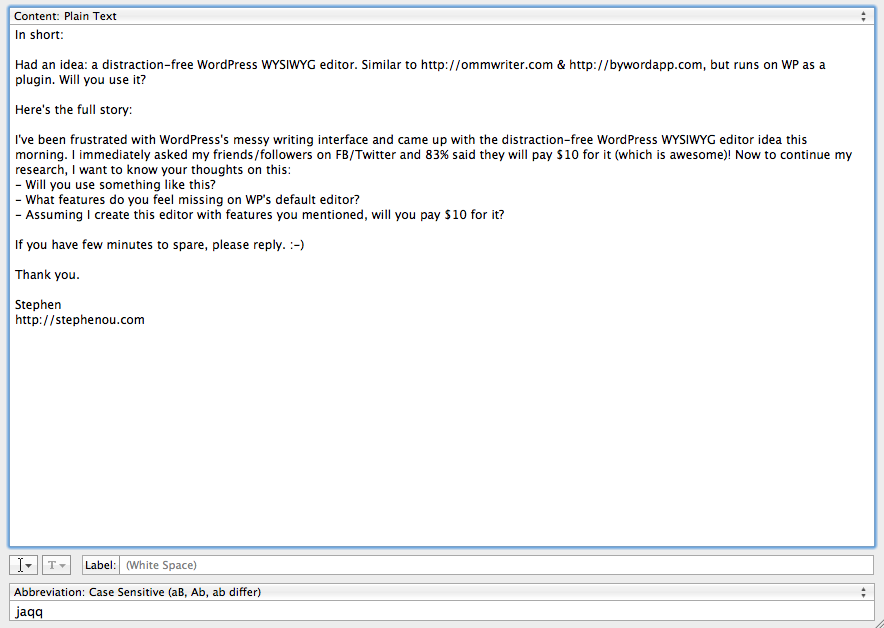
Technique #5: Use TextExpander to expand common-used snippets. I had my email templates saved in TextExpander. I can’t imagine sending out 96 emails in one night without TextExpander.

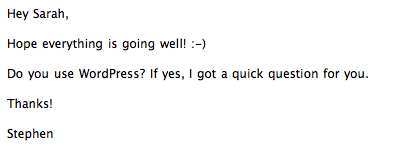
Technique #6: Make sure who I am asking is in my target area. If someone I want to email already had a WordPress blog, I ask them the question straight away. If they don’t have one that I am aware of, I send them a little “Do you use WordPress?” email first. If they say yes, then I ask the actual question.

Technique #7: Describe your idea in 1 sentence first. Then offer more details for people interested. If you only have the long version, some skimming-thru people will not understand it at all.
March 21, Monday
Forrst post
6:00 AM: Forrst is a vibrant community full of passionate designers and developers, so doing idea validation there was a no-brainer for me. I published the post first thing in the morning. But unfortunately, I only received 1 response on that day.
I felt instantly I was hitting a brick wall that stands in front of me, just because I didn’t get some satisfied responses on Forrst. But thinking about it for few minutes, I realized it was just one place. I’ve already received phenomenal feedback elsewhere.
Technique #8: Do not expect things to go popular everywhere. One didn’t turn out great was absolutely acceptable. It might be just an occasion that the time the post was published was a low-traffic period on Forrst, or it just didn’t catch enough people’s attention at the beginning. Who knows?
Email popular bloggers
7:00AM: Here is my logic: getting some influential people’s feedback would be helpful because their opinions usually represent many others. And by getting in touch early and keeping them updated regularly, they would spread the word when it’s ready. I had conversation with Erica Douglass, Pat Flynn, Jason Baptiste and Paras Chopra.
Technique #9: Send only short emails to popular bloggers. I know a lot of people trying to use long sentences because they want their recipients to know as much details as possible. But remember, they are busy people. If I give them one question that they can respond in a minute, I will have a better chance of getting replies.
March 22, Tuesday
Reply more emails
4:00 PM: There are more and more email replies coming in. I decided not to wait – just replying them instantly. I replied 14 emails, all with hand-typed (not TextExpander) answers, within 35 minutes. All 4 aforementioned bloggers replied to me as well.
Organize feedback
7:00PM: By this time, I’ve gotten literally hundreds of responses on my idea all across Facebook, Twitter and email. It was time to organize them.
Here’s how I did it:
- Re-read all email replies & tweets & comments
- Categorize them into 3 groups: Yup, Hmm, & Nope
- For Yup group, I listed exactly what their problems were with WP’s current editor
- For Hmm group, I identified what made them still staying on the fence
- For Nope group, I listed why they rather sticked with WP’s current editor
Technique #10: Trim down responses into bullet points, and put it in one place. There are a lot of feedback in a lot of places. I can get a clean look when they are all together. And I don’t have to go through all the emails and comments.
March 23, Wednesday
Analyze feedback
4:30PM: From yesterday’s notes, I broke them down even more. I was trying to think in their perspectives and figured out why they said what they said.
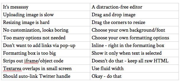
I especially focused on the group that were already willing to pay for the idea. I created a list of issues they were seeing. And on its right side, I wrote down the corresponding solutions and why/how it will work better.

Technique #11: Look at people’s pain-points. I create features not because it sounds cool and useful, but because it actually solves a problem.
7:30 PM: I also paid attention to those that did not want to use it (and most of them said they wanted to stick with a desktop publishing app). I boiled down some important elements on why they sticked with that, and tried to implement them in Artsy Editor as well. So it would attract those people from features they already enjoyed plus the powerful native WordPress functionality.
Technique #12: Differentiate what people really need and what people want because it’s cool. As Joel Spolsky said “80% of features are made for 20% of people.” Us geeks have a lot of weird thoughts and always want developers to add in the application. But it’s important to know which ones are absolutely essential and which ones aren’t.
March 24, Thursday
Design mockup
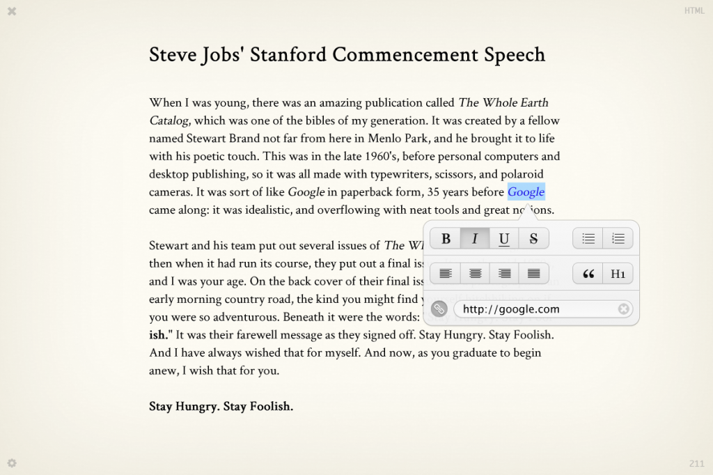
4:00 PM: After gathering feedback, it was time to transform into a design that people could actually see what my idea looks like. I decided to go with the simplistic, minimalist, distraction-free approach since that was what my initial intention was and what most people agreed with.
11:30PM: It was already late at night after all the main components were completed. I decided to revisit the page in a fresh mind tomorrow morning. So I could make better and clearer decisions on what needed to be changed.
March 25, Friday
Re-iterate mockup
Initial version:

Note that I did NOT include a lot of things. I haven’t showed all the settings, image editing, image uploading, etc. But I think it’s crucial to demonstrate what’s absolutely needed – the writing/editing interface. That’s where people will use my product. And that’s why most people decided to switch to my product – because WordPress’ writing interface is horrible.
After looking at it for 15 minutes, I found three problems:
- No way to choose “Open link in new window”.
- No word count.
- No way to delete link with one click.
- Ordered and unordered list should be in the top row since it is usually being used more.
Final version:

All problems fixed. And it looked pretty perfect.
Technique #13: Design one thing but make it really good. I didn’t make 10 crappy mockups. I made 1 that was very good. But that’s all it matters.
March 26, Saturday
Break
Instead of taking a week-long marathon, I decided to take a break – getting some fresh air outside and come back to work on Sunday. I was sure things could be done A LOT faster this way.
Technique #14: Take a break and refresh my mind is important. A lot of time, once I dive into something really deep, it’s hard to see it in a normal person’s perspective because of the emotional connection. Everything I’ve made will look so perfect that it’s hard to actually distinguish the bad from the good. So taking a break and looking at it again with a clear (unbiased) mind is really helpful.
March 27, Sunday
Share screenshots
10:00 AM: After polishing up the design here and there for an hour, it’s SHOW TIME! I first hit up my friends on Facebook again. Everyone seems to love the style, but they also had few suggestions.
Technique #15: Iterate quickly based on feedback. 3 folks that I talked to on Facebook chat told me the background color should be lighter. Instead of sticking with it, I fixed quickly. And it turned out great, only 1 person complained about it afterward.
Show on Forrst
12:00 PM: Although the response from my previous post on Forrst was not that good, giving it another try wouldn’t hurt. All my posts before had got quite a big attention. And the beautiful mockup I made would certainly have visual appeal. I submitted the post right at 12 o’clock.
Simultaneously I tweeted the Forrst link as well. I knew many of my followers on Twitter came from Forrst, so they might go and check it out. I also made the post public, so anyone could see the screenshots. They couldn’t like or comment. But that was okay, I just wanted people to get a sense of what it looked like and give me more feedback before I actually started building in.
March 28, Monday
Post on Dribbble
7:00 AM: With absolutely no expectation in mind (mainly because I was barely active on Dribbble, and I’ve only uploaded one horrible shot before), I posted my mockup on Dribbble. I didn’t check it for 4 straight hours, just wishing it will get 20 views.
12:30 PM: To my surprise, I’ve gotten 50+ likes when I checked at lunch time. Even though this number did not represent I was going to make millions, but at least people approved my design concept. And I could make sure this was not going to be those never-gonna-work ideas.
11:00 PM: Eventually, I was be able to get 92 likes and 9 comments on Dribbble, and 69 likes and 40 comments on Forrst. The feedback were very valuable.
To end this section, I’d really like to thanks Kyle Bragger and co. for building Forrst, and Dan Cederholm and co. for building Dribbble. Without both of them, my idea and project wouldn’t go this far.
Conclusion
After all, I was be able to learn a lot both about product development and customer interview. I’ve finally prevented many mistakes I made before:
- Not brave enough to show my ideas (Lesson learned: nobody is going to steal my idea)
- Writing code before testing my ideas (Lesson learned: I need to know if people are interested)
- Not asking what features are needed (Lesson learned: I need to know what people will pay for)
- Not keeping up with people (Lesson learned: keeping up with leads is just as important as getting leads)
Now you’ve read about my roller coaster experience that I went through with Artsy Editor in the last 2 weeks, you might want to learn more about Artsy Editor. Here are some FAQs:
What is Artsy Editor?
It is a premium WordPress editor plugin designed for comfort writing. Just few things why Artsy Editor is made for you:
- drag-and-drop to upload images
- drag corners to resize images
- add links inline, no more pop-up dialogs
- it doesn’t strip iframe/object code
- the formatting box is only there when you need it
- most importantly: a distraction-free interface where you can actually write!
When will it be out?
It will be out when it is ready. I know this doesn’t answer the question. But many unpredictable things can happen anytime. But what we can promise is: what you are going to get is top-notch.
How am I going to edit my custom settings for my post?
The concept is simple. Artsy Editor will behave as an overlay on the normal interface. You can write your post using Artsy Editor, and then edit your settings on the normal interface.
How much is it going to be?
It is not finalized yet. The average feedback we got was $10-$20 for a single-user license with unlimited installations. But few people had been telling me that would be underpriced.
Save 50%, just for you:
Enter your email below and you will receive an exclusive 50% discount when Artsy Editor is released!
 It’s been an awesome month since Artsy Editor launched back in July 27, and I want to share with you all the important events that had happened in the past 30(+) days with Artsy Editor.

